Community Corner
rebranding CBC Manitoba e-newsletter.
Overview
CBC Manitoba is looking to rebrand their newsletter for better user engagement. With removing their inactive subscribers and bots, they strive to have a refresh by rebranding their old newsletter “The Newsletter” to “Community Corner.” With the total rebrand, the tone CBC Manitoba wants to set for Community Corner is vibrant, polished, connected and friendly. Overall, the primary goals are to increase subscribers, bring in more engagement and to increase click rates.
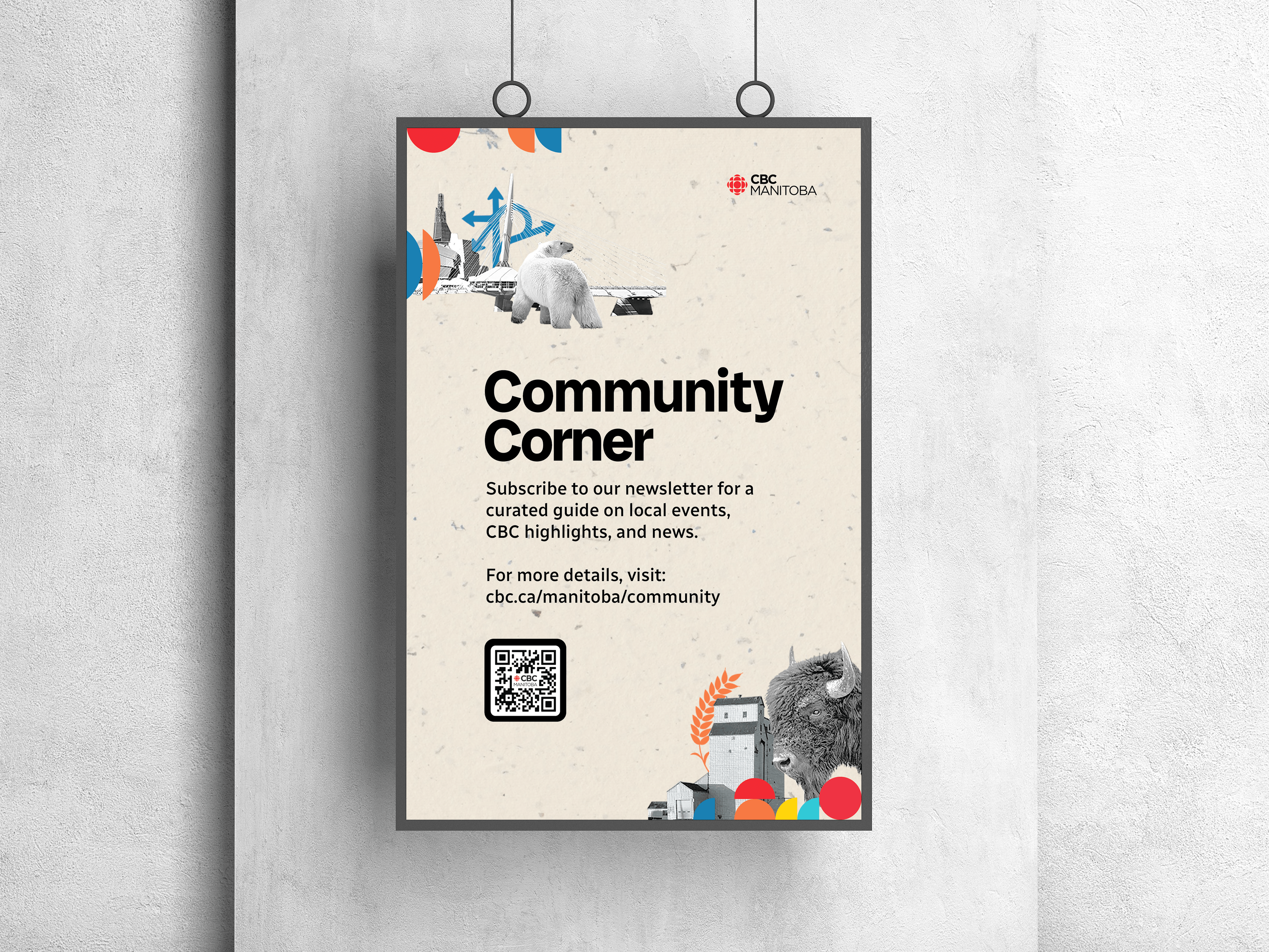
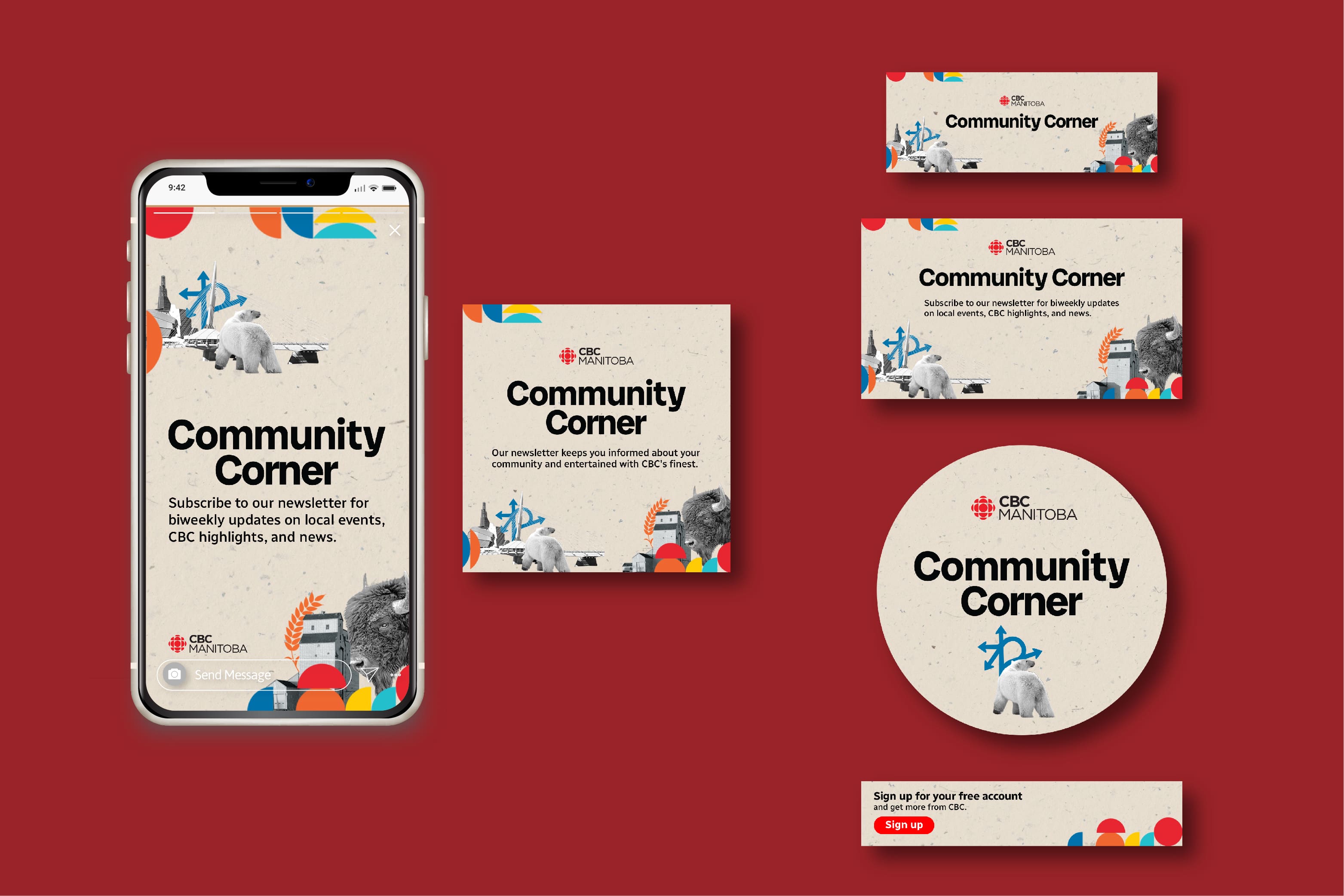
In redesigning the CBC Manitoba's newsletter, it was crucial to set an inviting tone for existing and new subscribers where they feel represented, and know that is curated for them. This includes identifying true symbols and imagery that symbolize Manitoba as a whole. The collage design not only represents urban areas, but also rural areas in exuding that it is their “corner.” The visual elements work cohesively, but also allowing room to incorporate and balance out with CBC branding.
Scope
- Brand & Strategy
- Digital & Social Design
- Print Design


